20+ Years Experience
Specialist Billboard Advertising

In the world of billboard advertising, the use of colour plays a crucial role in capturing the attention of consumers and influencing their perception of a brand.
From the psychological impact of colours on consumer behaviour to the selection of the best hues for digital billboards, this article will explore the importance of colour in advertising.
We will delve into the factors to consider for visibility and readability, how to create an attractive billboard with effective colour choices, and the utilisation of colour trends to enhance billboard designs.
We will examine the implementation of colour psychology for optimal significance and communication strategies through colour selection.
Join us as we harness the power of colours for effective billboard advertising.
Billboard advertising relies heavily on the use of colours to convey a captivating message to the audience. This makes the right choice of colours crucial for an effective design.
Using the appropriate colours can evoke emotions and create a strong visual impact, ultimately capturing the attention of potential customers.
Colour psychology plays a significant role in branding and marketing, and it’s essential to consider the target audience and the message being conveyed when selecting colours for a billboard.
Colours play a pivotal role in capturing attention in billboard advertising. Vibrant and contrasting palettes are particularly effective in drawing the eye of passersby.
The use of vibrant and contrasting palettes can create a visual impact that is difficult to ignore.
Bright colours, such as red and yellow, are known for their ability to grab attention from a distance, making them popular choices for billboards.
Combining these shades with contrasting elements, such as black or white text, further enhances their visual appeal.
This strategic use of colour not only draws viewers in but also enhances their engagement with the advertisement, making it more likely to leave a lasting impression.
The choice of colours in billboard design significantly influences brand perception. Specific colours can evoke different emotions and associations in the minds of the audience.
For instance, red can convey a sense of urgency or passion, whereas blue often symbolises trust and reliability. Yellow is associated with optimism and youthful energy, while green is linked to nature and growth.
Understanding these psychological connections is crucial for brands to effectively communicate their identity and values through billboards.
The cultural context plays a significant role in colour perception. What might be considered positive in one society can be quite different in another.
As a result, advertisers must carefully consider the message they want to convey and the audience they are targeting when choosing colours for their billboards.
The psychology of colours in billboard advertising explores the intricate ways in which different hues and tones resonate with the audience, shaping their perceptions and responses towards the displayed messages.
By understanding the psychological impact of colours, advertisers can strategically use them to evoke specific emotions and create a lasting impression on potential customers.
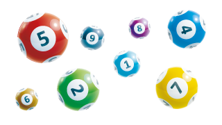
The effects of red, blue, yellow, green, orange, purple, black, white, and grey on consumer behaviour in billboard advertising are diverse, encompassing a range of emotional and psychological responses linked to each distinct colour.
Red, often associated with energy, passion, and urgency, can capture attention and create a sense of excitement, making it ideal for impulse purchasing.
On the other hand, blue, conveying trust, security, and serenity, can generate a feeling of trustworthiness and reliability, making it appropriate for financial and technology brands.
Yellow, symbolising optimism and youthfulness, can evoke a sense of happiness and warmth, attracting attention in window displays and clearance sales.
Green, representing nature, growth, and harmony, can encourage a sense of relaxation and peace, making it well-suited for eco-friendly and organic products.
Meanwhile, orange, a colour associated with enthusiasm, creativity, and affordability, can evoke a sense of adventure and attract impulsive buyers.
Purple, often linked to luxury, wisdom, and creativity, can create an air of sophistication and elegance, making it appealing for beauty and anti-ageing products.
Black, symbolising power, elegance, and authority, can convey a sense of luxury and exclusivity, making it suitable for high-end brands.
White, representing purity, simplicity, and cleanliness, can evoke a sense of neutrality and space, ideal for minimalist designs and health products.
Grey, associated with practicality, timelessness, and professionalism, can evoke a sense of balance and impartiality, suitable for corporate and technological advertisements.
Selecting the optimal colours for digital billboards involves a careful consideration of visibility and readability. The digital medium presents unique challenges and opportunities for colour usage.
To ensure the best results, it’s important to choose colours that are eye-catching and easy to read from a distance.
This can be achieved by using high-contrast combinations, such as black and yellow or white and blue.
Additionally, incorporating bold and vibrant colours can help attract attention and make the message stand out.
Visibility and readability are key factors to keep in mind when selecting colours for digital billboards.
High-contrast combinations and bold and vibrant colours can enhance the eye-catching effect and make the message stand out.
By carefully considering these elements, you can create a visually appealing and effective digital billboard.
When selecting colours for digital billboards, factors such as contrast and brightness should be carefully evaluated to ensure optimal visibility and readability, especially in varying lighting conditions.
The adaptability of the chosen colours to diverse lighting environments is crucial in maintaining the visual impact of the advertisement.
High contrast between the background and the text or imagery is essential to catch the attention of passing viewers.
Brightness plays a significant role, ensuring that the colours remain vivid and legible, even during daylight hours or under direct sunlight.
It’s essential to consider the potential reflections that might affect the visibility of the colours and make necessary adjustments to ensure their effectiveness in different ambient lighting.
Creating an eye-catching billboard involves harnessing the emotions evoked by warm and cool colours. It also involves employing effective colour combinations, and creating a visually compelling and emotionally resonant design.
Warm and cool colours play a significant role in capturing attention and evoking emotions in a billboard.
Effective colour combinations can enhance the impact of the design and make it more visually appealing.
The overall goal is to create a visually compelling and emotionally resonant design that will leave a lasting impression on the audience.
In billboard design, the strategic use of warm and cool colours can effectively evoke specific emotions and responses from the audience, shaping their overall perception of the displayed message.
Warm colours like red, orange, and yellow are known to create a sense of energy, excitement, and passion. When used strategically in billboard design, these colours can grab attention and convey a sense of urgency or action.
On the other hand, cool colours such as blue, green, and purple are associated with calmness, trust, and harmony.
Leveraging these hues in billboards can elicit feelings of relaxation, dependability, and stability, which could be particularly effective for branding and marketing messages.
Understanding the emotive potential of warm and cool colours allows designers to craft visually compelling billboards that resonate with viewers on an emotional level, ultimately enhancing audience engagement and message impact.
Identifying the best colour combinations for maximum impact in billboard advertising involves a thoughtful blend of hues and tones that harmonise to create a visually striking and memorable composition.
Effective use of colours can significantly impact the effectiveness of a billboard advertisement.
It is important to consider the psychological effects of different colours, as well as colour synergy – the way certain colours work together to create an appealing visual experience.
Research has shown that specific colour combinations evoke particular emotions and can influence consumer perception.
Creating a balance between attention-grabbing contrast and complementary colours is essential for capturing the audience’s gaze and leaving a lasting impression.
Harnessing contemporary colour trends can significantly enhance the appeal and relevance of billboard designs.
Successful case studies demonstrate the impact of current colour preferences on audience engagement.
By incorporating current colour trends into billboard designs, businesses can better capture the attention of their target audience and increase engagement.
This approach has been proven effective in numerous successful case studies.
In fact, colour plays a crucial role in visual communication and can greatly influence consumer behaviour.
As such, it’s important to stay updated on the latest colour trends and incorporate them into design strategies.
Not only does this enhance user experience, but it also improves search engine indexing. Breaking paragraphs into concise, easily digestible sentences with the use of
Additionally, adding quotes can add emphasis to important points and make them stand out to readers. This can further enhance the overall impact and effectiveness of the billboard design.
Implementing colour psychology in billboard advertising involves strategic communication strategies through the thoughtful selection of colours that resonate with the desired audience.
This ensures optimal visual and emotional significance in the conveyed message.
By carefully considering the use of colour in billboards, advertisers can tap into the psychological reactions and associations that certain colours evoke in people.
This can help optimise the effectiveness of the advertisement and enhance its impact on the target audience.
For example, using red in a billboard can create a sense of urgency and excitement, while blue can evoke feelings of trust and reliability.
Yellow is often associated with happiness and positivity, making it a popular choice for advertisements promoting products or services that aim to improve one’s well-being.
The use of colour psychology in billboard advertising is a powerful tool that can greatly influence consumer behaviour and perception.
By understanding the meaning and impact of different colours, advertisers can effectively convey their message and leave a lasting impression on their target audience.
Effective communication strategies in billboard advertising are intricately linked to the strategic selection of colours, leveraging visual and psychological cues to convey messages that resonate with the intended audience.
The colour palette chosen for a billboard advertisement plays a vital role in capturing the attention of passersby and leaving a lasting impression.
Bright and vibrant colours, such as red and yellow, can evoke a sense of urgency or excitement, making them suitable for promotions and sales.
On the other hand, calming hues like blue and green can instil a feeling of trust and reliability, ideal for branding and corporate messaging.
Understanding the psychological impact of colours enables advertisers to tap into the emotions of their target demographic, ultimately influencing their perception and decision-making processes.
The strategic harnessing of colours in billboard advertising holds immense power in shaping audience perceptions and responses, emphasising the profound impact of colour psychology on effective messaging and brand communication.
The selection of colours in a billboard ad plays a pivotal role in capturing the attention of passersby. Each hue carries a unique psychological impact that can evoke particular emotions and associations.
Warm tones like red and yellow often convey energy and positivity, while cool shades like blue and green can elicit feelings of calm and trust.
The strategic use of contrasting colours can enhance clarity and visibility, making the message more impactful and memorable.
The best colours for a billboard advertising campaign are usually bright and eye-catching colours such as red, yellow, and orange.
These colours are known to grab people’s attention and are more likely to be remembered.
Colours play a crucial role in the success of a billboard advertising campaign as they can evoke emotions and attract attention.
The right colour combination can make a billboard stand out and increase the chances of it being noticed and remembered by potential customers.
While there are no hard and fast rules when it comes to billboard advertising, it is generally advised to avoid using dark or muted colours that may blend in with the surroundings and go unnoticed.
It is also recommended to avoid using too many colours in one design, as it can become overwhelming and difficult to read.
Choosing the best colours for your billboard advertisement will depend on your brand, target audience, and the message you want to convey.
It is essential to consider the psychology of colours and select a combination that aligns with your brand identity and resonates with your target audience.
Using your brand colours for billboard advertising can be an effective way to create brand consistency and recognition among your audience.
However, it is also essential to consider the location and surroundings of the billboard to ensure that the colours stand out and are easily readable.
Different colours have different effects on people, and this can be influenced by culture, personal preferences, and the context in which they are used.
For example, red is often associated with passion and excitement, while blue is associated with trust and reliability.
It is crucial to understand the psychology of colours before choosing the best colours for your billboard advertising campaign.
We Aim To Reply To All Enquiries With-in 24-Hours